
In the last post I described, how the features for the GS & PPG match rating models are calculated. Based on these features I will now describe, how you build and optimise a linear regression model with R. The first part will describe the optimisation of the linear regression model for the GS match rating model in detail. The second part will cover the PPG match rating model. The third and final part will compare the prediction performance of the different models.
3 class prediction with linear regression
Predicting the outcome of a football match is a typical multi-class classification problem. The possible outcomes are: home-win, draw, away-win. But a linear regression can only solve binary classifications. Therefor, you have to reduce the multi-class classification to multiple binary classifications. The one-vs-rest strategy is the way to go. So you have to build 3 different linear regression models. Each model predicts the probability of a possible outcome and the corresponding inverse event (e.g. home-win & no-home-win).
Historic percentage distribution
The match rating models determine e.g. the probability of a home win for a match with a specific GS match rating. For this, you need to know, how many games in the past with a similar match rating resulted as a home win. Following SQL statement can be used to determine the historic percentage distribution:
GitHub – GS match rating historic percentage distribution
The statement uses the historic satellite, which contains the rating features, and aggregates the results of each match for every GS match rating. This is done for home win, draws and away wins. This data can now be loaded into R Studio. Exasol offers a R package, which provides an interface for connecting, querying and writing directly into an Exasol database.
library(exasol)
First you have to create a connection to your Exasol database.
con <- dbConnect("exa", exahost = "[IP-adress]", uid = "sys", pwd = "exasol", schema = "betting_dv")
The connection parameters need to be adapted. The shown parameters are the default ones, if you use the Exasol virtual machine.
For querying the database the Exasol package offers the method readData(). This one can be used to directly execute SQL queries and load the result set in a R data frame.
train_data <- exa.readData(con, "[SQL-Query]")
The function plot() can be used to get an impression, how the different probabilities are distributed.
plot(train_data$GS_MATCH_RATING,train_data$HOME_WIN_PERC, xlab = "GS match rating", ylab = "Home win percentage", col = "dark blue", pch = 22)
plot(train_data$GS_MATCH_RATING,train_data$DRAW_PERC, xlab = "GS match rating", ylab = "Draw percentage", col = "dark blue", pch = 22)
plot(train_data$GS_MATCH_RATING,train_data$AWAY_WIN_PERC, xlab = "GS match rating", ylab = "Away win percentage", col = "dark blue", pch = 22)
Following pictures show the plotted distributions. The percentage of home wins increases with the GS match rating. This is the expected behaviour. The higher the GS match rating is, the superior the home team was in past matches. Looking at the percentage distribution between -10 and 20, you are able to recognize, that the distribution follows a line. This is the target function, which can be determined with help of the linear regression. The outliers on the left and the right end of the scale does not fit this line as not many games occured in the past with such a high or low GS match rating.

Draws happen more often, when a match is more balanced. So the percentage of draws is higher with a GS match rating around zero. This plot does not seem to fit a straight line. It looks more like a bent graph.

- Historic draw percentage (Bundesliga 2011-2017)
The plot for the away percentage looks similar to the home percentage, but just inverse. The lower the GS match rating was, the higher was the percentage of away wins in the past.

Correlation test
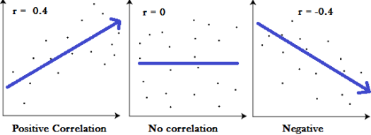
But does there really exists a linear relationship between the GS match rating and the different match outcomes? The plots indicate this, but this is no evidence. For this you have to do a correlation test. The result of a correlation test is between -1 and 1. The closer the result is to zero, the smaller is the relationship between two variables. A positive number represents a positive correlation, which represents a rising target function. A negative correlation represents a falling target function.
But which correlation value indicates a strong and a weak relationship? In most cases the Pearson correlation coefficient is used for a correlation test. Following values of a Pearson correlation indicate the strength of the relation:
High correlation: 0.5 to 1.0; -0.5 to -1.0.
Medium correlation: 0.3 to 0.5; -0.3 to -0.5.
Low correlation: 0.1 to 0.3; -0.1 to -0.3.
Determine the correlation in R is really simple with help of function cor(). You just need following commands to determine the correlation between GS match rating and the different match outcomes:
cor(train_data$GS_MATCH_RATING,train_data$HOME_WIN_PERC)
cor(train_data$GS_MATCH_RATING,train_data$DRAW_PERC)
cor(train_data$GS_MATCH_RATING,train_data$AWAY_WIN_PERC)
Following results are returned:
Home win percentage: 0.73
Draw percentage: 0.03
Away win percentage: -0.83
So, what does these results tell us? Obviously the GS match rating has a strong linear relationship with the home and away win percentage. Both variables are well suited for a linear regression model.
The correlation value for the draw percentage indicates, that there is no linear relationship to the GS match rating. Because of that, a linear regression model will return bad results when predicting the draw percentage. When you look back to the plot of the historic draw percentage, this could be expected. As already mentioned, the distribution looks more like a bend graph. So finding a linear function for that distribution is not possible. Such a problem can just be solved with the help of a polynomial regression model.
Fit linear regression model
Fitting linear regression models in R is really simple. You have to build 3 different regression models: for home wins, draws and away wins. The predictive system consists of only one variable, so the formula is just the relation between the percentage for the specific result and the GS_MATCH_RATING.
regr_home = lm(HOME_WIN_PERC ~ GS_MATCH_RATING, data=train_data)
regr_draw = lm(DRAW_PERC ~ GS_MATCH_RATING, data=train_data)
regr_away = lm(AWAY_WIN_PERC ~ GS_MATCH_RATING, data=train_data)
To get an indication, whether the regression model fits the observed data, you can use the summary function. The function summary(OBJECT) delivers some statistical information about a fitted model.
summary(regr_home)
summary(regr_draw)
summary(regr_away)
As one output you get the R-squared value. R-squared is a good start to look, whether your fitted regression line is close to your data. R-squared is a percentage statistical measure. A high R-squared indicates, that the regression model fits the observed data well. In contrast the lower R-squared is, the worse the model fits the observed data. Looking at our example we get following R-squared measures:
- Regr_home: 53%
- Regr_draw: 0.1%
- Regr_away: 69%
The R-squared for home and away wins looks not great but ok. But the R-squared for draw looks really bad. You are able to clearly understand, why this is the case, if you take a look at the calculated regression line.
plot(DRAW_PERC ~ GS_MATCH_RATING, data=train_data)
lines(train_data$GS_MATCH_RATING, predict(regr_draw), col="red")
As recognized earlier, the distribution of draw looks more like a parabola. The bigger or smaller the GS match rating is, the more unlikely is a draw. But a linear regression model will not be able to solve such non-linear problems. But how can we identify, whether our problem is a linear or a non-linear problem? The distribution of draws for the GS match rating is an easy example. There is just one variable and the non-linear relationship can clearly be identified. So the regression model is underfitted and only explains a small number of observed values.

But you should not only look at the R squared of your regression to determine, whether you model is good or bad. 59% R squared for the home regression model does not look very good, but they do not indicate, that the model is bad. This post at Minitab Blog explains a little bit more in detail, what are the possibilities and limitations of R squared.
Regression diagnostic plots
Some more information about your regression model is delivered by the regression diagnostic plots. These diagnostics plots offer information about the residuals of your regression model. Residuals is the error between the observed values and the prediction.
plot(regr_home)
plot(regr_draw)
plot(regr_away)
Residuals vs Fitted is the first regression diagnostic plot. This one can be used to identify non-linear relationships between the predictors and outcome variable. A good example for this are the Residuals vs. Fitted plots for the draw regression model and the home win regression model. The Residuals vs. Fitted plot for the draw regression model shows a parabola. This indicates, that there is a non-linear relationship, which is not explained by the regression model.

- Draw regression model – residuals vs. fitted
In comparison the Residuals vs. Fitted plot of the home win regression model does not show a real pattern. Ideally, all residuals are equally spread across the horizontal line. The relation between the predictors and the outcome variables seems well explained.

The plot of the away win regression model shows a slight pattern. A light parabola can be seen. So there could also be a non-linear relationship, which is not explained by the regression model. An optimized model will show, whether this is the case.

- Away regression model – residuals vs. fitted
Optimise linear regression
The regression diagnostic plots showed, that there is an underlying non-linear relation between the predictor GS match rating and the outcome variables for draws and away wins. In such cases a polynomial regression can help. The formula for a simple linear regression is: y = a*x + b. By using a polynomial of the predictor variable x, the regression model is changed into a polynomial regression. The formula for a second-degree polynomial regression is following: y = a*x² + b*x + c. R offers the function poly(), which can be used to produce a polynomial of a desired degree.
Creating the 3 different regression models as a second-degree polynomial regression looks like this:
poly_regr_home = lm(HOME_WIN_PERC ~ poly(GS_MATCH_RATING,2), data=train_data)
poly_regr_draw = lm(DRAW_PERC ~ poly(GS_MATCH_RATING,2), data=train_data)
poly_regr_away = lm(AWAY_WIN_PERC ~ poly(GS_MATCH_RATING,2), data=train_data)
The summary() function again offers some basic information about the regression models.
summary(poly_regr_home)
summary(poly_regr_draw)
summary(poly_regr_away)
If you take a look the summary of the polynomial regression for draws, you can see, that R squared increased from 0.1% to 4.2%. This still does not look much better, but this is an improvement. The summary also shows the different values for the coefficients of the polynomial formula. The 3rd coefficient for the square part of the formula has got a negative value. This indicates, that the parabola of the regression model is opened downwards.

The effects of switching from a linear to a polynomial regression can also be seen, when comparing the different regression lines.
plot(DRAW_PERC ~ GS_MATCH_RATING, data=train_data)
lines(train_data$GS_MATCH_RATING, predict(regr_draw), col="red")
lines(train_data$GS_MATCH_RATING, predict(poly_regr_draw), col="blue")
The red line represents the linear regression model. The blue line represents the polynomial regression. The polynomial regression fits the observed values better as the linear regression. But you can also see, that there are still many observed values, which are not well explained by the regression model. That’s why the R squared is still very low.

But you should not optimise the model until you get the maximum R squared. This will just cause a overfitted model. The polynomial draw regression model with the 8th degree polynomial has got a R squared of 42.1%. This looks really good in comparison to 0.1% or 4.2%. But is this a good model? No! The regression line shows many ups and downs, which fits the observed values, but will not be useful for the prediction of future values. The model is overfitted.

This is something you have to avoid, when optimising predictive models. A underfitted model explains observed and future values not well enough . A overfitted model explains observed values very good. But will not fit future predictions.
Using a polynomial regression for the away win percentage shows also a slight improvment. The linear regression model has got a R squared value of 69%. This can increased to 70% with the help of a second degreee polynomial regression model.

The Residuals vs Fitted plot for the home wins already indicated, that the relation between GS match rating and the home win probability is well explained with a linear regression model. A polynomial regression model increases the R squared value just by 0.03%.

Prediction
After the different regression models are optimised, these models can be used to predict the probabilities for a home-win, draw and away-win for games with a given GS match rating. Therefor you have to create a prediction data set. The prediction data set has to contain the same predictors and outcome variables as the train data set, but without values for the outcome variables.
train_data &lt;- exa.readData(con, "[SQL-Query]")
Following SQL query can be used to create a prediction data set:
GitHub – GS match rating prediction data set
The train data set of this example contains all historic Bundesliga games from 2011 – 2017. The prediction data set contains all Bundesliga games played in the current season. Additional to the predictors and variables the data set contains the Hash keys for the single matches. So you can easily write back the data into the database and integrate and analyse it with the existing data.
As the prediction of the outcome of a football match is a multi-class problem, several steps are needed to execute the trained regression models and calculate the probabilities for the different outcomes. First the predict() function of R must be used to determine the probability of each regression model.
pred_data$PROB_HOME_WIN <- predict(poly_regr_home, pred_data)
pred_data$PROB_DRAW <- predict(poly_regr_draw, pred_data)
pred_data$PROB_AWAY_WIN <- predict(poly_regr_away, pred_data)
Because of doing 3 single predictions, the sum of all probabilities will not exactly be 1. This can examined with a check sum.
pred_data$check_sum &amp;lt;- pred_data$PROB_HOME_WIN + pred_data$PROB_DRAW + pred_data$PROB_AWAY_WIN
But of course the sum of all outcomes of a football match should have a probability of 100%. This can be corrected in different ways. One of the easiest ways is to proportional increase or decrease the probabilities.
pred_data$COR_PROB_HOME_WIN &amp;lt;- pred_data$PROB_HOME_WIN / pred_data$check_sum pred_data$COR_PROB_DRAW &amp;lt;- pred_data$PROB_DRAW / pred_data$check_sum pred_data$COR_PROB_AWAY_WIN &amp;lt;- pred_data$PROB_AWAY_WIN / pred_data$check_sum
These results can then be stored into the database.
&lt;span class="mceItemHidden" data-mce-bogus="1"&gt;&lt;span&gt;&lt;/span&gt;&lt;span class="mceItemHidden" data-mce-bogus="1"&gt;&lt;span class="hiddenSpellError" pre="" data-mce-bogus="1"&gt;EXAWriteTable&lt;/span&gt;&lt;/span&gt;(&lt;span class="hiddenGrammarError" pre="" data-mce-bogus="1"&gt;<span class="mceItemHidden" data-mce-bogus="1"><span class="hiddenGrammarError" pre="" data-mce-bogus="1">con = con</span></span>&lt;/span&gt;, schema = 'BETTING_DV', tbl_name = 'FOOTBALL_MATCH_HIS_L_S_LINEAR_REGR_PROBS',&lt;/span&gt; overwrite = 'TRUE', data = pred_data)
After writing the prediction results to the database, you are able to compare the results to other models or simulate a betting strategy with historic results. But this should not be part of this post.
All code examples of this post can be found at GitHub:
GitHub – GS match rating optimisation
The next post will take a look at another optimisation method. This will be shown with the PGP match rating. After that, the different optimisations can be compared and we will see, what is more suited to predict the results of a football match, the goal difference or the average number of gains points.
If you have further questions, feel free to leave a comment or contact me @Mo_Nbg.

3 Replies to “Validate Model: GS & PPG match rating (part 1)”